iOS Mobile App for Mental Health
Case Study
Introduction
Committed to democratizing therapy, it serves a seamless, inclusive, and tailored journey towards wellness by providing offers for therapy.
Ama Mind simplifies the pathway to mental health services, meeting the increasing demand for accessible care.
This platform guarantees privacy and relies on scientifically validated methods, making quality mental health care a right, not a privilege.
Problem statement
How can we ensure that users continue to engage with our app beyond a single use after finding an offer?

My role as a Product Designer
in a nutshell
Dark & Light Mode
290+ screens
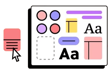
Component Libraries
Includes
Variables
and
Design Tokens
Ready for hand-off

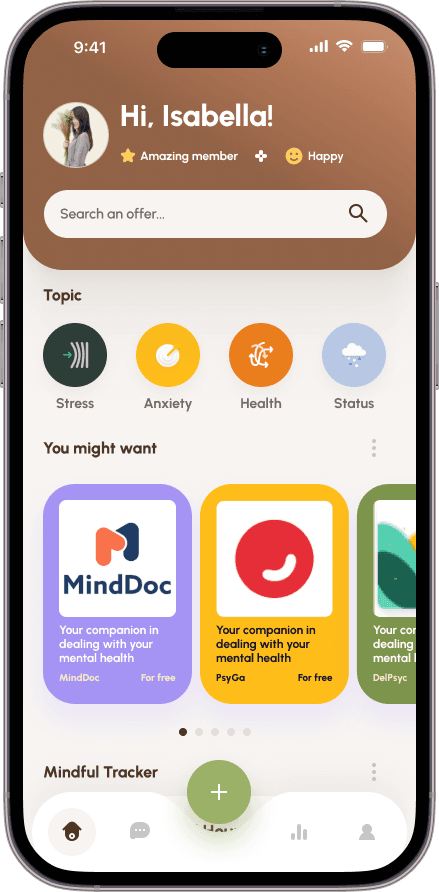
The problem
We were only displaying offers. Awful UI overall.
The solution
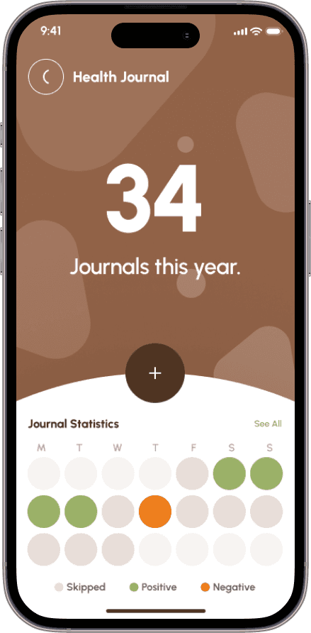
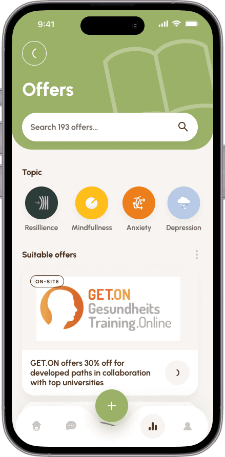
Something better for the eye. Let's see how the work was done.
Let's dive into it!
My Design Process
UX
Atomic Design
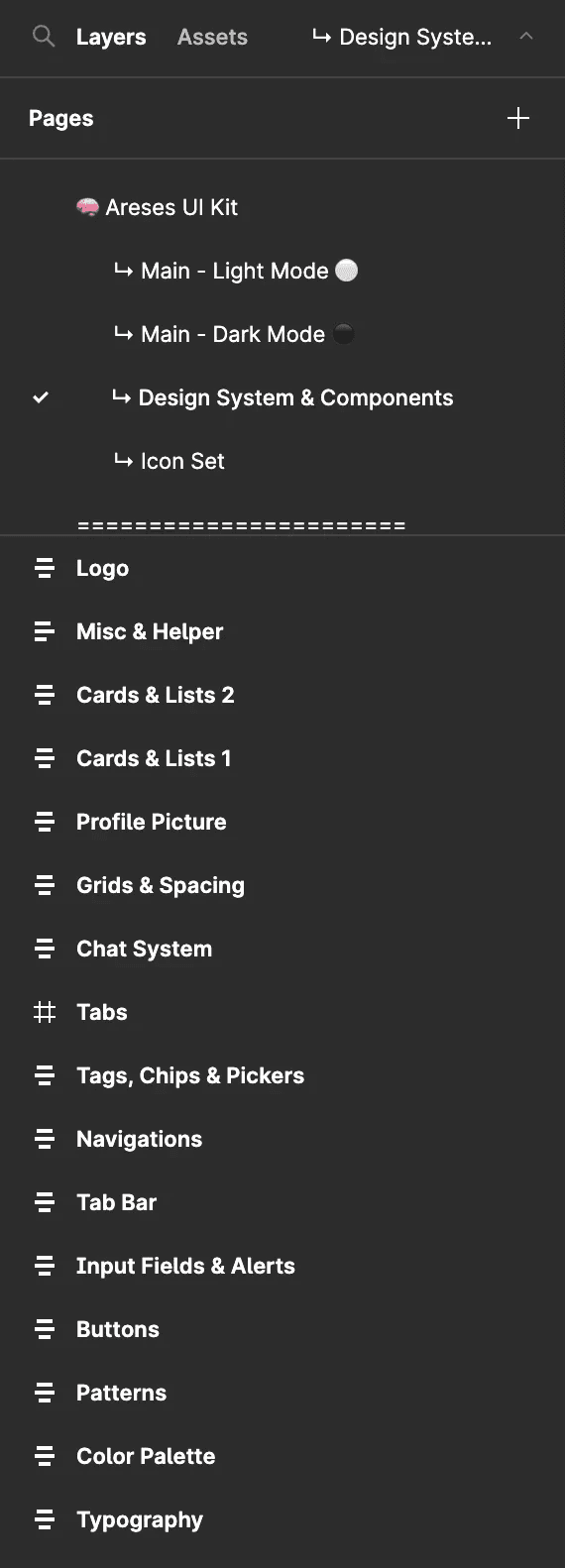
We hold weekly cross-disciplinary meetings to craft our design system, 'gemüt,' reflecting comfort and cohesion. Leveraging Atomic Design, we categorize our design elements in Notion and begin with typography, colors, and spacing. This foundational work supports consistent color variations across our products, detailed further in the following section. I also built a grid system for proper lining.

We had to keep in mind that we are partnered with different companies with different logos and identities that will coexist together in our app.
The color system used for UI illustrations is based on a neutral color palette utilized in harmony with our partners' brands. This creates a sense of cohesiveness between the illustrations and other UI components.
Below: our colour study
Creating components
To ensure the quality of our components, we prioritized three key elements:
Accessibility: We checked the color contrast ratio and used all lowercase to respect the brand and comfortable character spacing on CTAs to enhance accessibility. The minimum size of tab buttons on mobile is 48px.
Intuitiveness: We followed an adaptive design approach to ensure our components are platform-friendly. For example, a progress indicator component was used to guide the user through the survey and provide an understanding of the survey's progress without tiring the end-user.
Aesthetics: We believe in stepping up our UI game by using modern design elements such as clean and minimal design, rounded corners, vibrant colors, and smooth shadows, in accordance with Jakob's law.
Ama mind
/
Rafa Areses Design System

Share

98%

Impact
Working on our design system has posed significant challenges, but it has yielded several benefits for our company on various fronts.
Regarding our team:
Development: Our design system has simplified the lives of developers by enabling seamless communication with the design team when discussing implementation.
This has allowed them to focus on features rather than low-level UI primitives such as color and space values, small components, interactions, states, etc.
Design: Thanks to our readily available library of components, designing high-fidelity interfaces has become a straightforward task, reducing the time taken from days to just a few hours.
For the user:
While the benefits mentioned above pertain to internal aspects of the company, the true impact of our design system can be seen in the enhancement of our user experience and the possibilities it has.
Woohoo!
This design system has allowed us to build prototypes quickly for other clients, test more ideas, evaluate our hypotheses faster, and create more variations to A/B test.
Go ahead and check out one example!
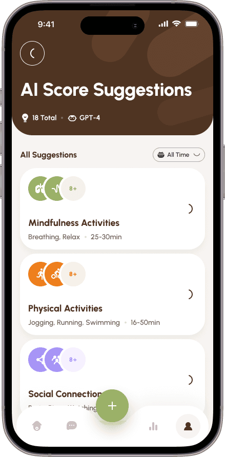
Fostered with AI
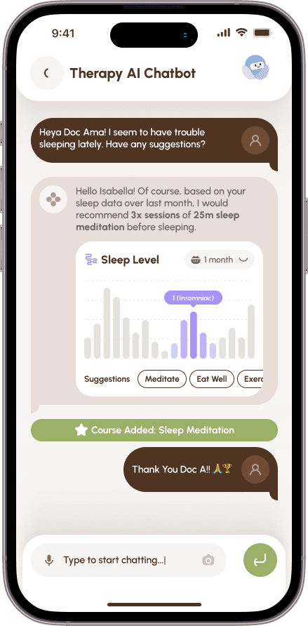
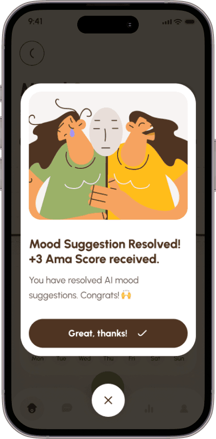
Users can get AI suggestions based on our database curated by psychologists.
And now much more
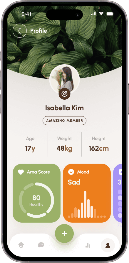
It became the all-rounded app with tons of possibilities and much higher engagement.
Learnings
The process of resolving this issue has provided an exceptional opportunity to enhance our expertise in design system creation and UX design. Although we encountered a few obstacles during the course of this case study, we were able to draw upon our extensive knowledge and experience to overcome them.
Putting in practice various design principles and techniques enabled us to navigate through challenging circumstances, resulting in substantial improvements to our skill set.
The challenges we faced included managing time and resource limitations, ensuring that our product components were bilingual to accommodate our diverse user base, and bringing together various stakeholders for seamless collaboration.
Next Steps
Expand mental health services through partnerships.
Introduce personalized matching algorithm.
Continuously improve user interface and experience.
Launch social support feature.
Enhance app security and privacy.


